 |
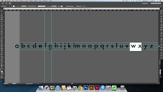
| My Development Of The Bold Characters |
Wednesday, 6 November 2013
Typefaces and Fonts - Design Principles
Today we had a discussion about the work we were set from last week (here), and how the differences between the standard, light and bold can define how well a typeface works. By this, a font could be really effective and efficient as a regular font, but it may not work in light or bold. We also had a discussion about what constitutes a font being italic and the generally accepted standards that come with it.
To build on this discussion and the work from last week, we further developed our work to make the bold, light and italics more recognisable so as to increase to functionality of the typeface as a whole.
Monday, 4 November 2013
Alphabet Soup - Illustrator
Saturday, 2 November 2013
The Mask DVD Case
This is the DVD case from the mask, a Jim Carrey comedy film. The quirkiness of the main text and the choice of bright contrasting colours reflects the character of both the actor and the character he plays. The inflated-looking text reflects the fun aspect of the film.
Friday, 1 November 2013
Alphabet Soup - Typeface - Final Crit
Today was the final crit for the third studio brief. I went into the crit quite confident about my work as I knew that I had reasons for everything I'd done in the project, and could easily justify them. I was slightly concerned that it didn't aesthetically represent Sophie though.
The feedback was unanimously positive, and when Simon asked people what sort of personality traits they thought of when they saw my font, two of the responses were "positive" and "progressive", which pretty much sum up the attributes of Sophie I wanted to represent.
The feedback was unanimously positive, and when Simon asked people what sort of personality traits they thought of when they saw my font, two of the responses were "positive" and "progressive", which pretty much sum up the attributes of Sophie I wanted to represent.
 |
| My Final Font Drawn On Tracing Paper And Printed On Paper |
Alphabet Soup - Illustrator
 |
| I Then Noticed That The Points On The V And W Went Above And Below The X-Height And Baseline, So I Edited This To Make Them Fit In More With The Other Letters. |
Subscribe to:
Posts (Atom)


