Friday 29 November 2013

Frame (Photoshop) Interim Crit

Today was the interim crit for the frame project. The questions I asked were:

  • Which was the most relevant concept and why.
  • What sort of shops could you see that concept being in.
  • Have you seen anything similar in your research.
  • Who do you think would buy it. 
The feedback was very mixed. A lot of people thought the ruler concept was most relevant to the brief, but then it would be in shops such as Ikea, which is something I wanted to stay away from, hence the more quirky concepts of the other two. I think subconsciously I had already written this idea off. 

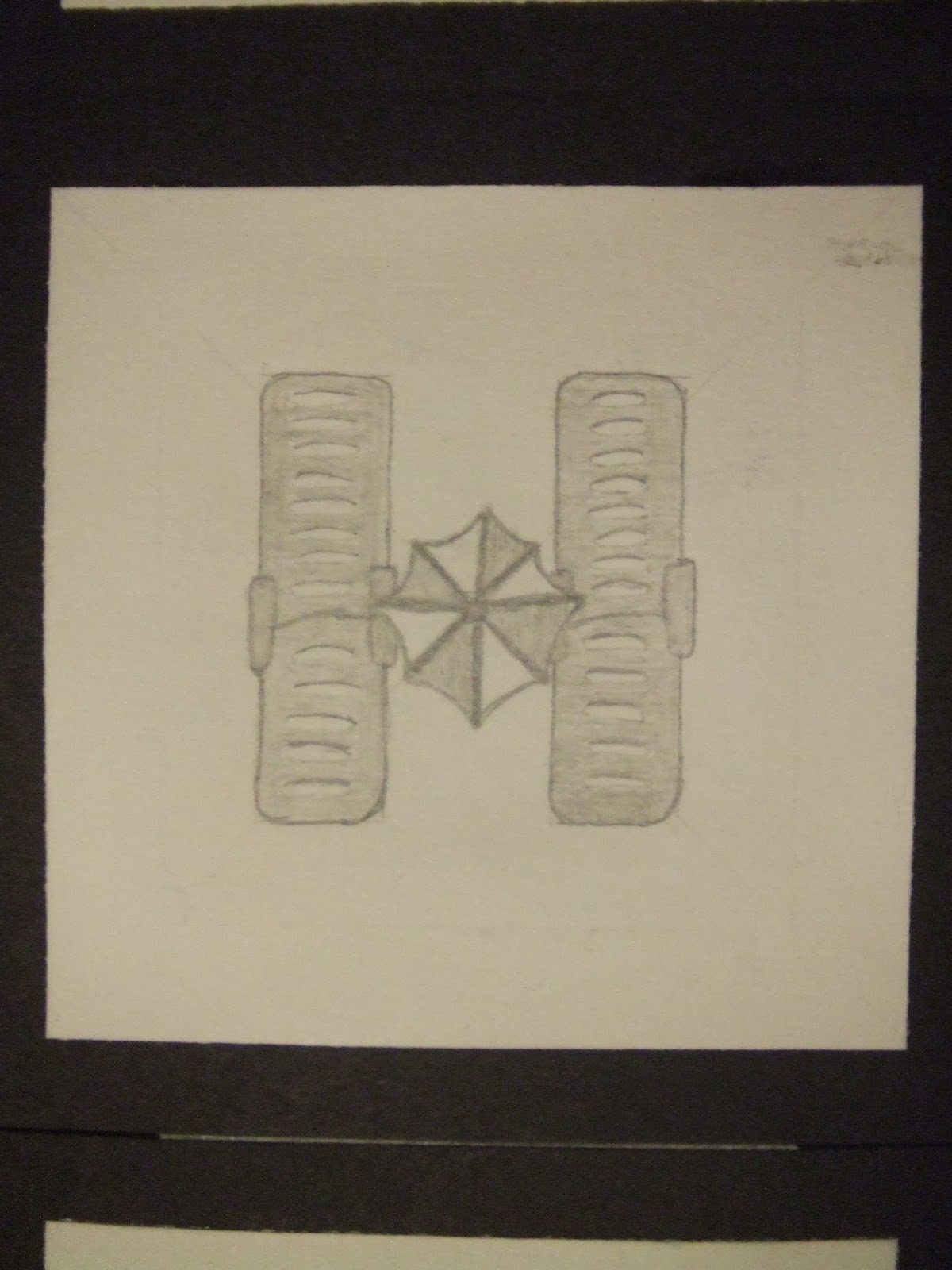
There was concern within the Goldilocks idea that the violence (to a very slight extent in my opinion) was in a design primarily aimed at children, and this could detract parents from buying it. I'm not sure how true this is, because to be honest, if I was buying a photo frame for any reason, I wouldn't even consider the background photo. What was encouraging though was that like me, they'd not seen much like it in their research, because I wanted to do something new. 

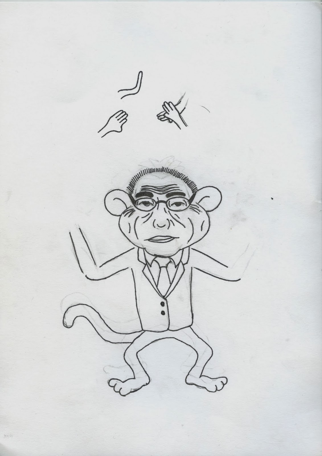
I think the most positive and useful feedback came on the Betty Boop idea. Although no-one really answered the question of what shops they'd be found in, there was positive feedback about the idea which I hadn't considered. Someone commented on the fact that the eyes are looking in different directions involves the buyer more, and someone said the the fact that Betty Boop is a brand would help the frame sell. I'm quite sure not everyone read the spider diagram I drew explaining the idea, because those two comments said nothing about the innuendo behind the concept, which suggests to me that it isn't strong enough. The most useful comment was that the tone was unclear, because I was using the tradional style of Betty Boop but making it more adult, and for it to work clearly I would have to "break the stereotype", which is something I'll look into further, as the Betty Boop idea is the one I would want to take forward.

However, it dawned on me that this idea doesn't lend itself too well to the photographic and photoshop element of the brief, which is a main part of the assessment. After seeing other peoples work and ideas I came to the conclusion that the Betty Boop concept was too over-thought and complicated anyway, and as I can no feasibly take 3 photo's of a little girl fighting bears, I am pretty much forced to run with the ruler idea. Fortunately I have picked up some ideas from other peoples work about layering and using lighting to make the composition more interesting, which addresses my primary problem with this idea, which was that it could possibly have been quite dull and boring.

Frame (Photoshop)

Below is what I intend to take to the crit on Friday.

Concept 1

Using photo's of rulers to make up the shapes
of the numbers of the dimensions in inches of
the photo frames.

Concept 2

Goldilocks fighting the 3 bears rather than running
away from them.

Concept 3

Betty Boop looking happier and more excited
as the size of the frame increases, intended to
be a play on penis size innuendo.

Friday 22 November 2013

Summer Project - Pre-Uni


A – A Levels

Before starting college I thought that A Levels were going to be really dull and boring. Fortunately I was surprised for the better, my tutors were all really easy to get along with and I made some great friends there despite there being a large amount of people at college who I’d known from secondary school.


B – Bike

Cycling is something I enjoy doing either by myself or with friends. That said, I do particularly enjoy cycling on my own as it gives me time to myself where I can just think. It was hard to come by this sort of peace when I was living at home, and I think that’s the main reason I started enjoying going out on my bike so much.


C – Chocolate

Chocolate is amazing. I’ve always loved it, at one point in year 7 I used to eat three bars a day. I’m not all that addicted to it now, but I still love it. I remember watching the original Charlie and the Chocolate Factory in infant school, and ever since then I’ve had a love for chocolate.


D – Disney

I’m not really a big fan of films, because generally I like watching shorter shows like the Simpsons and Futurama that I know are going to be good, rather than sitting through a film for 2 hours only for me to possibly not enjoy it. That said, I’ve always enjoyed watching Disney films because generally they’re easy to watch. My particular favourites are Finding Nemo, Kung-Fu Panda, and Pirates of the Caribbean.


E – England

I’ve been abroad quite a lot for holidays, and as much as enjoy it for a change of scenery, I always find myself missing England. I think it’s particularly important to appreciate our country at the moment given how volatile other parts of the world are.


F – Formula 1

Formula 1 racing isn’t something a lot of people enjoy watching, people tend to find it boring and monotonous. I just think it’s great to have a sport where teams need to work so closely together in order to make things work properly for them, and at such high speeds they need to be sure that things are safe. If there’s even a slight miss-calculation by just one member of the team, things can go wrong very quickly. It’s this sort of unpredictability that’s the reason I enjoy F1.


G – Games

I’m a big fan of playing FIFA, I don’t really enjoy playing it by myself though. It’s the competitive side which I enjoy about it, so I’d much rather play it with someone else than on my own. I’ve always been quite a competitive person, so I take most games I play quite seriously. Over the summer I’ve developed a love for playing snooker and pool, but I’ve always enjoyed playing Monopoly and Chess as well.


H – Holidays

I know it sounds rather contradictory that I like going on holiday as well as saying I like England, but it’s difficult to not enjoy going on holiday. I can’t think of anything more relaxing than laying in the sun listening to my iPod, knowing that if I get too hot I can jump in the pool. The only thing I don’t like about going on holiday is flying, which is something I really hate doing, everything about it is uncomfortable. 


I – Internet

The fact that people across the world can talk to each other for free using the internet is pretty impressive. The internet is great, I can’t imagine our society being the same without it. I know it has its down sides, mainly people being able to find things they shouldn’t, and cyber-bullying. But generally, I think the internet is definitely a good thing, and I can’t imagine life without it.  


J – Jack Sparrow

Going back to my enjoying of Disney films, Captain Jack Sparrow from Pirates of the Caribbean is probably my favourite film character from any film that I’ve ever seen. I particularly enjoy him in the first film, where his characters sense of humour is at its best. I think the irony of him being the way he is rather than the stereotypical pirate is what makes him such a great character. 


K – The Killers

The Killers are my favourite band. I only really started listening to them when they released human in 2008. Since then I’ve bought all their albums, and heard all their songs. I saw them live in Sheffield last year, but I ended up over-paying on the tickets because I was on holiday when the tickets went on sale, but they were sold out when I got back. Despite paying over twice as much for tickets as they were originally on sale for and me and my mate being completely sober, it was easily the best night out I’ve ever had. 


L – Logic

I’ve always been mathematically minded, and because of this I’ve always thought and worked in a logical way. I can sometimes find it difficult to spontaneously come up with an idea. I have to have some sort of starting point, and then work my way to some sort of conclusion with one thought leading to another thought. It’s just something that’s a bit strange about me, as most art and design people tend to be a lot less rigid in their thought process in my experience. 


M – Manrique

I was on holiday in Lanzorote in the Canary Islands a couple of years back, and having already been to 3 other of the islands, I knew that the buildings were all the same. This was because of a man called Cesar Manrique. It was his idea that was adopted by the Canary Islands that all buildings should be no more than 3 stories high, and should be either white or cream. His influence was so strong, that when a massive dark-coloured hotel was built in the capital of the canaries (Santa Cruz, Tenerife), there were bomb threats even during the stages of construction. I think it’s amazing that design can have such a strong influence on people. Manrique lived in Lanzorote and I visited his house, which is now one of the main tourist attractions on the island. Manrique built the house himself and made use of the natural lava bubbles in the land to create rooms. It was possibly the most visually attractive building I’ve ever seen. 


N – Neville Brody

When doing A Level graphics, Neville Brody was one of the designers I researched. Normally I’m not a fan of using loads of colour in typography, hence why my work is all in black and white, but ever since I researched Neville Brody I’ve liked how he’s bold with his use of colour, and tends not to stick to a particular colour scheme. I think this is because I tend to be rather rigid in my use of colour, and so this is something about his work that I wish I would allow myself to do.


O – Ocean

For as long as I can remember I’ve always loved the sea. The idea that there are so many different animals living in the sea that humans will probably never discover them all amazes me. The sea itself has an oddly calming sort of influence about it, which is particularly strange given how powerful it has the potential to be. I’m not really the sort of person who is inspired very often, but I always feel a strange sort of sense of inspiration whenever I’m by the sea. 


P – Pool

At college I played a lot of pool with my friends who’d moved up with me from school, but it was a great way to start talking to people who I hadn’t met before. I enjoy playing pool because it has the competitive element to it without it being too serious, as well as it having an element of skill to it.  


Q – QI

I’ve always been a fairly inquisitive person and I tend to want to know how things work and why things are as they are. This was the main reason I took physics at A level. I tend to watch a lot of comedy quiz programmes on TV suck as Have I Got News For You and Mock The Week, but QI has always been a favourite because it’s more scientific and less topical. 


R – Gerhard Richter

Gerhard Richter is a German artist whose work I saw at an in the Tate Modern Gallery in London when I was about 10. A particular painting called Abstract Painting No. 439 which he painted in 1978 caught my eye, and is really the reason I started to like painting and art in general. When choosing my options for GCSE, art was the first one I picked despite not being great at it, and so it was suggested that I did graphics instead. I chose both, and I enjoyed graphics so much that since then I wanted to do a degree in it. 


S – The Simpsons

I’ve watched the Simpsons for ages, and it’s probably my favourite TV show. Despite being a cartoon comedy show, I’ve found that its comedy is rather relatable to graphic design. When I watch old episodes that I watched when I was younger, I find different parts funny to what I did when I watched them as a child. This shows that the writers have included something for everyone, which makes for good design. 


T – Traveling 

I hate traveling, I always have done and always will do. Being quite tall I don’t appreciate the lack of legroom available on most modes of transport, coaches and airplanes in particular. It is similar to when I go cycling that I tend to think a lot when travelling, the only difference being that when I go cycling I can choose how long I want to do it for, I’m out in the fresh air, and generally it’s a more pleasant experience than being cramped up. 


U – United

I’m a big follower of football, and I’ve had a season ticket at Sheffield United for the previous nine seasons. I was never really into football as a young child, and only started going as an excuse for my grandad to go. But since the 2005 Champions League Final between Liverpool and A.C Milan, where Liverpool came back to win the game after being 3-0 down, I’ve really enjoyed watching football. I haven’t played as part of a team since Y6, because I think it’s taken way too seriously at a non-professional level, and it wasn’t fun. 


V – Viva la Vida

Viva la Vida by Coldplay is my favourite song, I remember hearing it for the first time on the radio. It was around that time when I started listening to the Killers as well, and it was mainly these two bands that made me really start to enjoy listening to music, whereas before then it was just something I’d do to help pass time when I was on a long journey in a car or was walking to a friends house or something like that.  


W – Winter

I love everything about winter, although it does all centralize around the weather, if we get snow in the winter, I spend barely any time indoors. I love sledging, snowball fights etc, and of course it’s nice to have a break for Christmas. 


X – Xabi Alonso

Going back to my enjoyment of football, Xabi Alonso is a footballer who currently plays for Real Madrid and Spain. He scored the equalising goal for Liverpool in the 2005 Champions League final between Liverpool and A.C Milan, it made the game 3-3, ending with Liverpool winning the resulting penalty shootout. Had he not scored that goal and Liverpool lost, that game probably wouldn’t have had the same influence on me as it did, and I probably wouldn’t enjoy football as much as I do now. For all I know I might not ever have really gotten into football. At the time I had started seeing Sheffield United with my grandad, but really me going was just an excuse he used to go. I doubt that without Alonso’s goal in that game I’d love football as much as I do today. 


Y – Yo-Yo Loach

I keep tropical fish at home, and have kept about 40 species of them over the previous 5 or 6 years. Probably my favourite species that I’ve kept is the Yo-yo loach, as it was one of the very first fish I bought when I started up with my first fish tank. The particular one I bought is still alive today and has out-lived all of the other fish I’ve bought since. It’s called the yo-yo loach because the markings on its side look like the letters y and o.  


Z – Zoo Tycoon

Zoo Tycoon was a computer game I used to play in which you had to create and run your own zoo. I loved the game because I’ve always liked animals, always enjoyed creating things, and I enjoyed the strategic and business element behind the running of the zoo, and making enough money to buy more animals and create more enclosures etc. A friend who lived around the corner from me at the time also really enjoyed the game, and so we spent quite a lot of time on the game when we weren’t at school, which is probably why I remember it so well and enjoyed it so much.  

Wednesday 13 November 2013

Message Delivery Posters - Context

The below images show how my posters could work in different contexts

Flyers


Billboard


Newspaper Cartoon


Mr Kipling Box

This Mr Kipling box shows different styles of text being used in conjunction to good effect, as the different styles of text draw your eyes to the information in order of importance, meaning that Kipling and 6 Viennese Whirls are the first things you see, but the less important text creates a decorative effect whilst still being legible and making sense in logical order.

Tuesday 12 November 2013

Message Delivery Posters - Further Development

Today I edited further my posters taking on board the advice given to me in the crit. This is most obvious in the removal of the full stops from the text poster, but I also noticed in the crit that people's text posters were generally more successful when a more gothic font was used, so I changed the font from Impact to Helvetica and slightly altered the layout, but I did experiment with Futura, but the blockier style of the Helvetica letters was more appropriate. From here I modified the text and layout of the image and text poster. I lowered the text because it split up the whitespace more, I got this idea from my research into Conservative Party Election Posters. I also modified the FIFA logo so that it was somewhat recognisable without being the actual FIFA logo, as I was told in the crit that I wouldn't be allowed to use it in a live brief. Personally I feel that my posters work better individually now because they're more high impact without losing how they work together as a set. 


Monday 11 November 2013

Mothers Union Leaflet

When at a funeral I saw this leaflet for the mothers union in the church, something in which I have no interest in or links to, so I think it says a lot about the typography that I picked it up to look at it. The simplicity of white and black gothic fonts on a green background were effective alongside very little imagery. 


The type tempted me to open up the booklet to see what was inside it and I saw this. Not only was the simple typeface used creatively to good effect, but it shows how it can work on a gradiented background and alongside more complex imagery.


The back page shows how small and simple text can be used as a layout with the only image being negative space. It uses different colours to strong effect without looking amateurish  something which I find particularly difficult to do myself.

Saturday 9 November 2013

Message and Delivery Posters - Final Crit

Today was the final crit for our posters. I was pleasantly surprised about the feedback I was given from the class as a hole, not because I had a lack of faith in my designs, but more because I was unsure as to how clearly the messages were conveyed as obviously I had gotten quite into the project and was worried that I'd convinced myself that the posters had worked when in actual fact they hadn't.

The first poster I presented was the purely image one as I spoke about the First Direct advert with the beatboxing birds and how this poster was more of a concept for design rather than a stand alone thing. The general feedback was that my final poster communicated the poor decisions made by FIFA in awarding the world cup to Brazil, Russia and Qatar because of the denotations of the flags and the very very limited connotations that the 3 countries share. The symbols of the footballs make clear that the poster is about the world cup, which then makes it obvious that the 3 wise monkeys are ironic/sarcastic in a childish manner, which is what I was going for.

Somewhat surprisingly, the text poster was the one that came under the most criticism. The general feedback was that while it worked well in that it further clarified the context of the other two images, it wasn't really "high impact" in itself. A specific example of this was my use of the full stops after the three "no evils", as apparently they make the poster look separated into halves. This poster will be worked on before submission to take these comments on board.

Peoples reaction to the text and image poster were quite interesting. Being stood at the front an being able to see peoples faces as they read the poster suggested to me that the poster was definitely "high impact". There was a brief discussion about how clear it was that the messages weren't genuine and were clearly ironic and sarcastic. I was however criticised for using FIFA's official logo on a poster which is so clearly and seriously mocking them, and this is something I need to address on both this poster and the image poster.

One observation that was made was that the style of illustrations and the way I positioned FIFA to look would make my posters suitable for use in newspaper cartoon strips, which was again something I looked at, and so it was suggested I print on newsprint rather than just the regular paper I presented my work on.

Image Only Poster


Text Only Poster


Image and Text Poster

Friday 8 November 2013

Message and Delivery Posters

Today, after building on the crit yesterday, I developed the image poster so that the monkeys were more in context with my research, and by adding the FIFA symbol and the flags, the denotations of the 3 countries along with the connotations of monkeys are enough to communicate FIFA's incompetence in my mind.

My Image Poster

Someone commented in the crit about the drawings reminding them of the drawings in newspaper cartoons, so I did some research into this to give me an idea of what font to use for my text poster, an this is what the result was.


However, I didn’t feel that this font was high impact enough. After experimenting with a few fonts, I decided that the above font (ironically called “impact”) was the most effective and high impact. I think this is because of how well balanced the bold-readable aspects of the font is. Another more subtle positive of using this font over “noteworthy” is that the “No Evil” are all much more clearly aligned, which gives a more organised feel, which is an important connotation of a serious poster in my opinion. 

My Text Poster

From here I decided that my text and image poster needed to tie the two together somehow. The obvious and boring way to do this would be to use the words from the text poster and the FIFA logo with the 3 wise monkey images, which was something I wanted to avoid. 

As part of my research I looked at the First Direct adverts with the Northern Platypus and The Beatboxing Birds. Those adverts originally came about my showing 10 seconds of a beatboxing bird on TV and that was it, no context (like the image poster my crit yesterday). Then about a month later a concept came in the form of the platypus (like my text poster), becuase it was obvious that this was the same concept when you compare the two. Then when the actual advert came out, everyone was enlightened as to what the platypus and birds were about, and the image and type poster was my chance to bring the 2 posters together. 

My Image and Text Poster

By using the FIFA logo I have clearly identified who the target of my posters message is, and used discriminative message extremely similar to the ones Sepp Blatter (the monkey) had said himself according to my research. These 3 posters now work as a set in that anyone who's read the text poster will associate it with this poster, and then this poster with the image poster.

That said, I believe they all work individually as well. The image poster has enough connotations and denotations for the message to be worked out by people who know about football, whereas the message in the text poster is obvious due to the nature of the poster. The third poster however works on two different levels. People interested in football will recognise the logo and associate the racist quotes with Blatter, pick up on the allusion to the 3 wise monkeys, and see the irony in Blatter as a monkey. People who aren't interested in football however, will be alarmed by the discriminative quotes, and then associate them with FIFA, which raises the profile of their incompetence and ignorance, which was one of the things I wanted to do.

Thursday 7 November 2013

Alphabet Soup - Illustrator - Print Induction

Today was our print induction for the digital print resource which included printing the font we'd each produced for study task 2 (here)

My Final Font Based On Vernation

The font itself may not look too different to a classical gothic font such as Helvetica or Futura, but the x-height is 1.6 times the height of the ascenders and descenders to fit with the Fibonacci Sequence. I edited the v and w so that the points didn't rise above the x-height to fit to the patterns in nature, as well as moving the points on the z to line up with the straight terminals. I also raised the tittles of the i and j to be lined up with the ascender height. The letters with circular bowls such as a, b, d etc have an inner radius:outer radius ration of 1:1.6 to fit with the Fibonacci sequence, as well as the c, e and o being perfectly circular. The letters with shoulders however have inner:outer radius ratios that vary slightly around 1:1.6 to represent the anomolies in nature that don't fit the "rules" such as the platypus.

Message and Deliver Posters - Interim Crit

Today was the interim crit for the message delivery posters, but knowing that I have all day tomorrow to work on the project, I have done a lot of research in an attempt to ensure that my posters give the right sort of message and are in the correct tone. Because of this, all I presented in the crit was my initial 4 sketches of ideas for the image poster and an initial mock up of the three wise monkeys poster shown below in an attempt to get feedback on the concept.

What I Showed In The Crit

Unfortunately people didn't really give much useful feedback, although this was only to be expected due to the lack of context I included.  However, people commented that the concept of the 3 wise monkeys worked well with the style of illustration, and that the style of illustration was quite childish, which was what I was going for.

This means that tomorrow I won't really have much to go on during the development stages of my poster, but hopefully there will be people around me who's opinion I can ask throughout the day.

Wednesday 6 November 2013

Message Delivery Posters

Today I started using illustrator to stick Sepp Blatters head on a monkey to use on the image poster to run with the theme of the 3 wise monkeys. Unfortunately, due to only being allowed to use two colours, this didn't work very well as shown below.

My Attempts To Digitally Produce A Monkey Sepp Blatter Weren't Working Very Well

I then decided that I'd draw the character, and because of Blatters almost childlike attitude, I tried to draw it in a very cartoony sort of style, which I think I achieved.


My Drawing Of Blatter As A Monkey

From here I edited it in illustrator to get it to do the 3 actions.

Here No Evil, Say No Evil, See No Evil Sepp Blatters