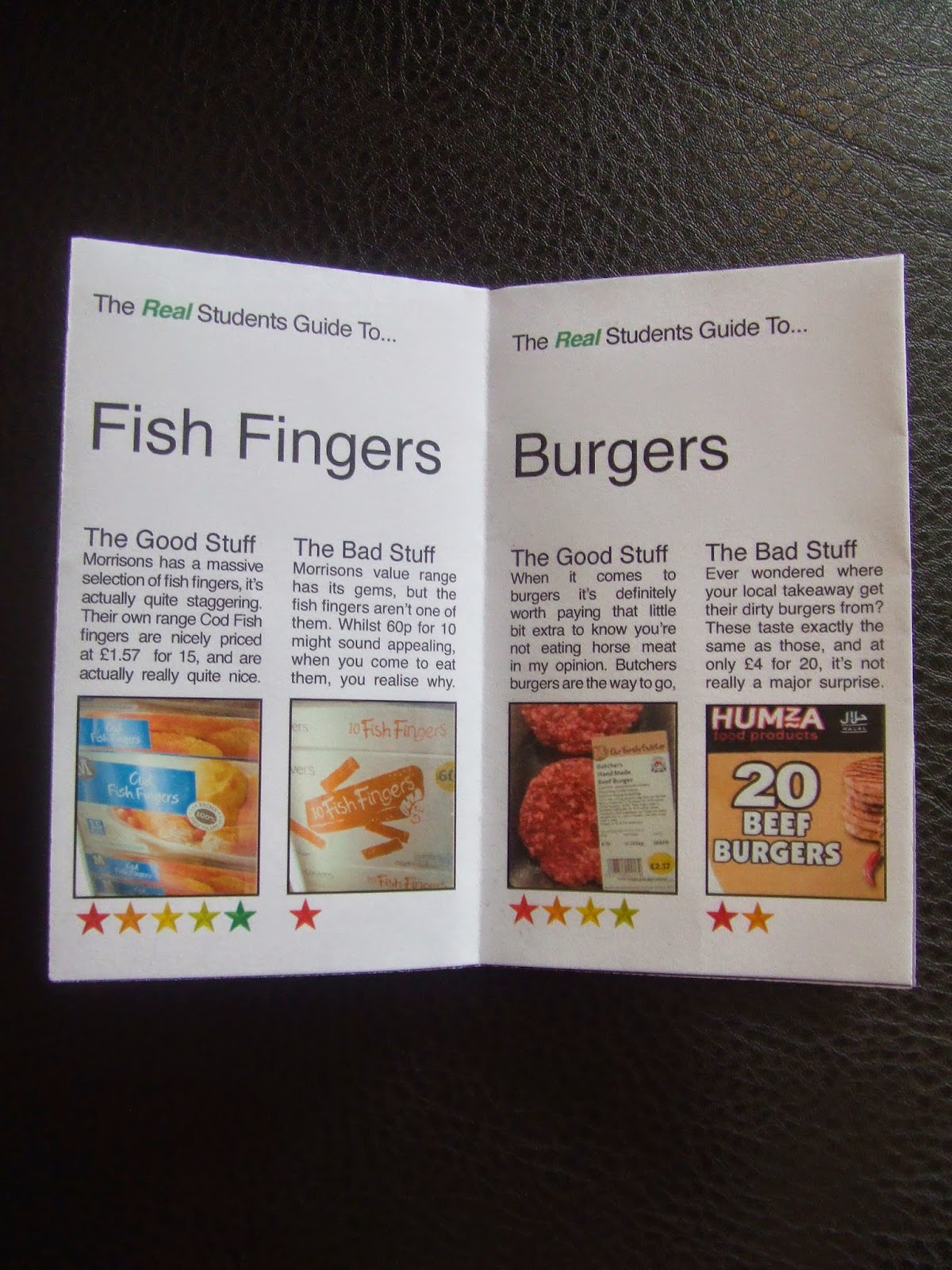
Initially, the reception was good, people found it quite funny and said the content was good at the same time. However, a few issues were raised.
- The front and back pages were too text heavy.
- The columns were too narrow to use fully justified text.
- A two column layout is too serious for the tone of the text.
- It wasn't clear what the stars represent.
- A serif font would be more appropriate because serifs are less boring and therefore more fun.
Fortunately the most time consuming thing about what I'd produced was the content, and so re-arranging the layout shouldn't be too much of a time-consuming job.
My crit group also felt that the humour could be taken a lot lot further, which is something I was pleased about.


No comments:
Post a Comment