Friday 28 February 2014

Communication is a Virus - Interim Crit

Today was the interim crit for our group project, communication is a virus. We presented the research we'd done on as well as the very little amount of actual work we'd done on the project itself. 

We were given the topic "become an expert it", which doesn't lend itself to viral communication very well because, essentially, if you're showing someone how to become and expert in something, you're teaching them something, which isn't the sort of thing that viral campaigns are generally used for. To counter this, we thought we'd use a more specified topic which isn't very interesting and try and make it interesting, as that was what we were going to do with the initial task anyway. As a group, we decided to use recycling and re-using things as the focal point for our campaign.


We decided that we'd create a blog that showed people inventive ways to re-use stuff that they'd otherwise throw out. This focuses more on the re-using of objects as opposed to the direct recycling of them, which makes it instantly seem more fun and interesting. We looked and existing blogs and websites that have the same idea, and came to the conclusion that they're all a bit drab, ineffective, and un-interactive, which is one of the reasons we stuck with the idea. There's no point in re-doing something that's already been done really well, but we felt that we could do this project to a much higher standard than the existing material. The 4 screen shots above are examples of what currently exists.


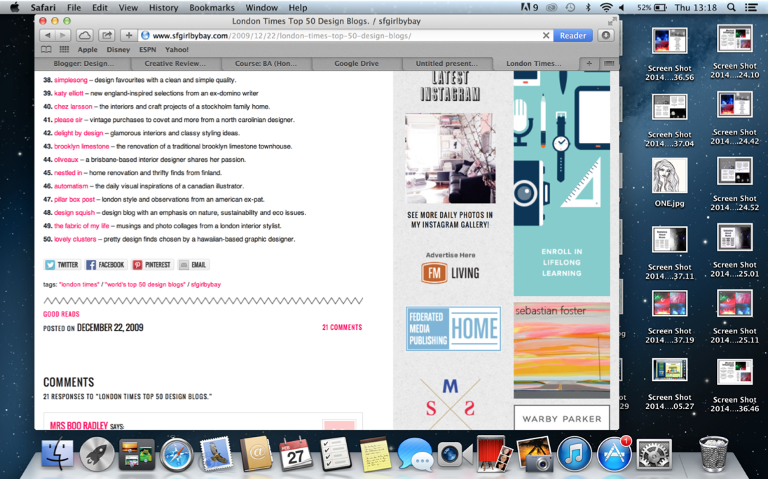
In order to make sure we didn't end up designing a crap looking blog, we looked at a few design blogs for inspiration as to how ours should look. We chose design blogs because naturally blogs on design will look nice. The above 4 screen shots are examples of blogs we liked the looks of, the one in the top right particularly interested us because of it's simple layout and simplicity of interactivity. The bright colour scheme also gives off the positive sort of vibe that we want to give off. 


We looked into the sort of content that we could include on our blog and found plenty of ideas such as the five photos above. Obviously some of them are a lot more ambitious than we will most likely be, but it gave people in the crit the overview of our idea.


The above photos were set up and taken by Tim Noble and Sue Webster. Aside from being quite unique pieces of art, we feel that they show how things that you'd probably have thrown away can come together to make something quite funky and decorative.


The "Dumb Ways To Die" video is something we took inspiration from in quite an obscure way. The video itself shows no link to the Melbourne Metro System until the closing few seconds of the video. The video promotes the Metro systems safety messages purely by association, which is something we hope to do with our campaign, as this will allow us to ignore the more educational side of the blog to some extent, as we can claim to be educational by linking our blog with some existing educational resource on recycling.


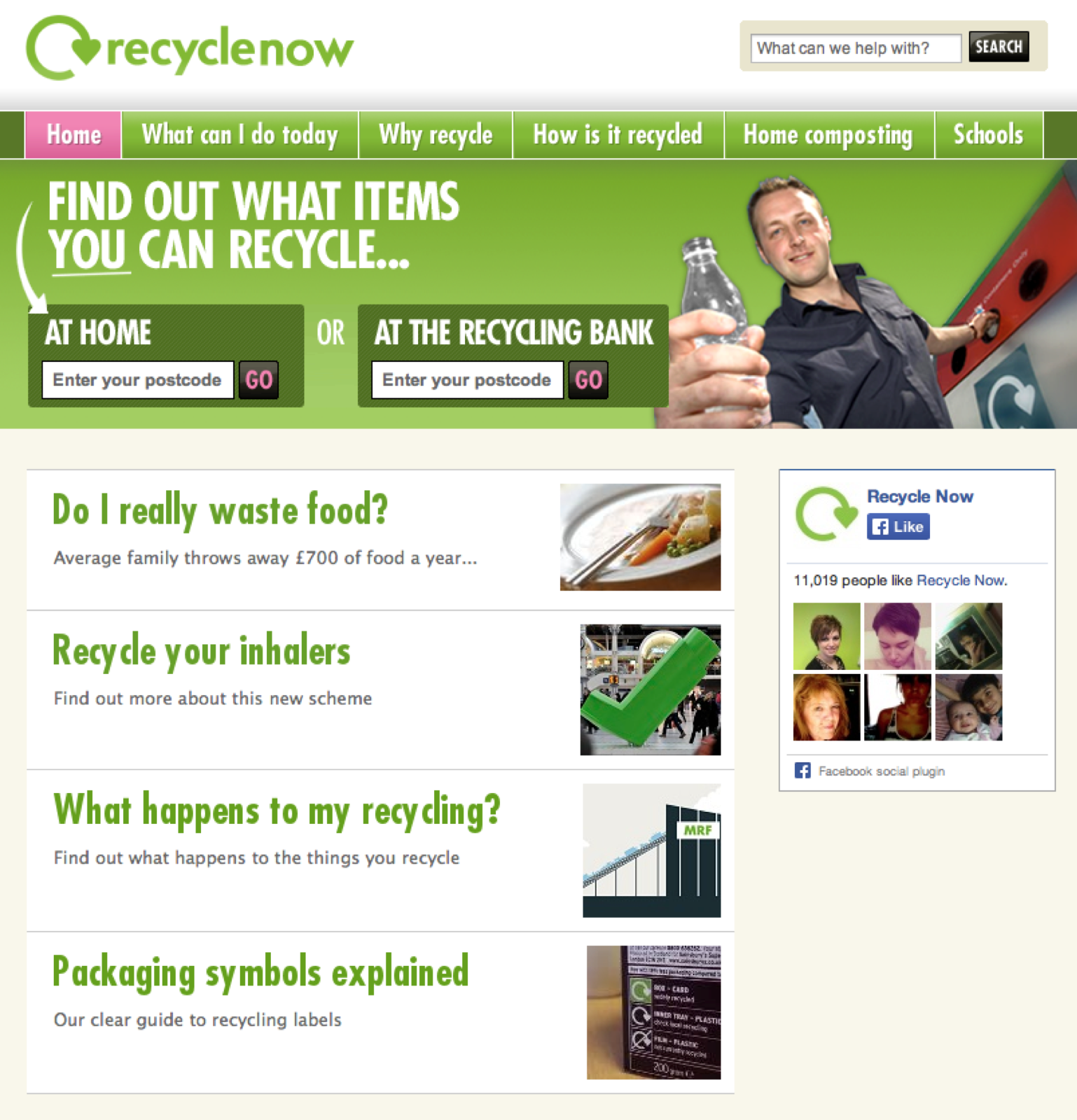
There is a government campaign going at the moment called recyclenow that is encouraging general recycling to quite an educational extent, but it's not really aimed at the younger generations, which are the ones which use the internet more and are more impressionable, whereas our campaign will target these audiences. 


This is the logo that we developed taking inspiration from 


We then used some beer bottles and cans that I'd been saving for this purpose to create some things that are useful to some extent as way of demonstrating to the group the range of what can be done with such basic recyclable items that are easy to come across. 


The first things we made were the Christmas tree and the wind chime. The Christmas trees structure was just bottles padded out with a bin bag then wrapped in tinsel. The wind chime was a lot simpler than the tree as it was just a case of tying different lengths of string to empty cans of carling and sticking them to a piece of card which could be moved.


This was a lot simpler. Just using bottles as vases doesn't really take
 much effort and can look quite nice if the are actual flowers available...


This was more inventive, we made shoe holders with various different 
bottles, they're quite quirky but not necessarily particularly useful...


We then found two empty squash bottles which we used with a piece
of card across to hold DVD's and games on. This is considerably more
useful than the other things we made, but could definitely be experimented
with more, as it's not overly stable at the moment.

The feedback from the crit was generally quite positive. It was suggested that having the photos of shadows isn't as much re-using things as it is hoarding, so it might be better that we stick to the more useful things. This works two ways as it was suggested that what we were campaigning for is quite a hipster-like thing, and, especially in the context of Leeds, is something that students would be interested in doing. On top of this it provides them with a free way to get unique stuff. What hipster doesn't like having limited edition things. Some people were concerned about what we were trying to send viral, which is just the idea of re-using things, there is no advertising video or anything like that. Facebook often has loads of posts that have been shared numerous times because they're interested, and we're hoping that some of the images we post on our blog will go viral in this way.

Wednesday 26 February 2014

Grid System Session

Today we had a session on grid systems, specifically about being able to un-pick a grid from magazine spreads, to help us understand and come up with our own grid systems.


I took 2 double page spreads from 2 of the magazines I used for my type hierarchies, The Economist and Total Film, and unpicked their grid systems.

The Economist


Total Film


What I notice from these two magazines is that generally they're 2 column systems, but sometimes the inside column is thicker than the outside column, by roughly a ratio of 2:1, which is strange, as I would assume that if 2 columns were split in that way, it'd make more sense to use a 3 column grid. This, I suppose is done to accommodate the images more to give more room for manoeuvring when it comes to images without them looking out of place from place to place. 

Also, whilst I appreciate that these grids aren't exactly modular, generally they're set up in 3 rows, although they're variable across the spread. This is particularly re-assuring, as in the previous task that required us to produce double page spreads, I often struggled to line up text and images in the rows given that the columns are fixed.

Tuesday 25 February 2014

Grid Systems

Grids offer ways to organise the text and images you want to use, mainly using margins, rows, columns and guides. In the final print the grid is invisible, but adds a reading flow to the page. A great example of this is a newspaper or magazine.


Grid Systems by Kimberly Elam


This book had different pieces of design with a sheet of tracing paper over the top that displayed the different grid systems and how the layout is set. This design stood out as its used different techniques all mixed together but still had a sense of order. You can see the columns of light text going from left to right and then the bold text on the right page goes from top to bottom while being interrupted by the bold titles, again with the different grids noted on the tracing paper.


The design on the page to the left is from Herbert Bayer, he uses the contrast of thick and thin rules that give direction to the eye and carries it down the page. The use of rules is also shown in the right image, this is the work of Willi Kunz. The rules on the left side give structure to the title while the thinner rule at the top right adds direction to the layout.


Here is work by Jan Tschichold. The tracing paper that covers over it shows a direction that your eyes travel in, this is formed from the rule that underlines the top left title, the bold title on the left and the smaller vertical rule towards the bottom in the middle. Then to the left of that is the name of the type used, this is displayed vertically adding direction to the right.


This use of a grid shows images displayed over text with the opacity manipulated. This could be an interesting way to display an infographic.


Layout by Ambrose & Harris


These pages show module based grids, the left is an asymmetrical module based grid and the right image has been split into 16 smaller fields - this offers more decisions when placing your content. 


This shows a symmetrical grid which is based on proportions instead of measurements. Each page is a mirror of the opposite, this gives two equal inner and outer margins. This allows marginalia which are annotations and comments that are made in the margins. 

I feel that the use of grid aids readability massively. The book, Grid Systems by Kimberly Elam gave me understanding on the visual hierarchy and how to use headlines, subheads, body copy and rules. I found that the use of white space within grids is also an effective tool, this was highlighted in the Layout book by Ambrose & Harris. The use of a module based grid when displaying images gives you a choice of options, you can use some of the blocks to add focus on the body copy by leaving them blank. The emptiness of white space draws your attention to the nearest thing. 

Friday 14 February 2014

Secret 7 - Final Crit and Evaluation

Crit
This morning was the crit for the Secret 7 brief, the first brief in OUGD406. I presented my final design printed on antique white paper in the digital print suite. I did this because due to the colour difference between on-screen design and printed design, I wanted to be sure the background wasn't exactly white, and was more off white. I chose to use the digital print resource after being underwhelmed at the quality of the laser printers.

My Final Design

We were in small groups for the crit, so the quantity of feedback was quite limited, but I was very pleased with the feedback I was given, which was:

  • My idea was very original and unique.
  • The design has an immediate impact on you due to the contrast.
  • Part of the reason it works is its simplicity.
2 Of the other people in my group had completed their work, but one was still developing hers. She had stitched an image of Lorde and it looked amazing. She'd then scanned it into the computer and implemented it into her design, but it didn't look anywhere near as nice as the actual stitched image itself. She was talking about how she was going to scan it again, which didn't make much sense to me. I suggested taking a photo of it as that wouldn't press all the stitching flat like a scanner would. I think this could make quite a difference to her work if she decides to try it.

PHOTO

Evaluation

What Went Well
I feel that my research was very in-depth and useful for this project. The fact that often my research contradicted itself shows the depth I went into. I also feel as if I had a strong pool of initial ideas, and I think I could have made a success of any of the 5 ideas I took into the interim crit.

What Didn't Go So Well
In all honesty I don't think I experimented very much with this project post-interim crit. I think I lost some steam after getting such positive feedback in the interim crit and possibly got a bit complacent. By this I mean that my initial ideas were quite creative, I doubt many other entries will have taken close-up photos of bread or made shapes out of ground coffee, but when it came to developing my design further after the crit I sort of stopped trying to think creatively and stick to the concept I had so as to avoid it becoming too abstract. I'm not sure if this was the right decision to make on reflection, but either way, I put it down to me being a bit arrogant about my feedback.

What I'd Do Differently
Like previously mentioned, really the only thing I'd do differently in terms of production would've been to think about more creative ways to take my design forward, which is something that I found was lacking in the second half of the project. Also, something I'd try would be to print it on gloss paper as well as the antique white, as a lot of peoples work looked more commercially viable than, and those that did tended to correlate with being printed on glossy paper. That said, the whole point of the project is for the designs to be one-off individual pieces, not necessarily commercially viable, and I think my work fits this description about as perfectly as it could do.

My Opinion On The Brief
I really respect what Secret 7 is doing, and think it's a really great and fun thing to take part in. I also appreciate how doing more obscure charity briefs such as Secret 7 is useful to our development as designers, as it's something very different to everything we've done so far, the only thing that's arguably similar to it is the Frame Brief from OUGD405. I would however, question it's suitability for it being an academic brief on this course. Two of the main benefits of this particular Graphic Design course are that we are taught to design for other people and not ourselves, and the large amount of feedback we get on our work. I don't think this project is in any way consistent with these benefits. This project was about creating something personal and individual to ourselves. Not only does this go directly against the first point I made, but it also limits the usefulness of the feedback given to us due to how everyone will view each others work differently. I also think that if people are producing personal work, there's quite a large window for people to get offended by feedback, especially given the anonymous nature of the crits we partake in. Don't get me wrong, I've really enjoyed this project, I just worry that it's a brief that is more directly linked to a Fine Art course than a Graphic Design Course.

Thursday 13 February 2014

Secret 7 - Upload

My Final Design

Proof Of Upload

Confirmation Of Upload

Example Of Context

Example Of Context