 |
| I produced another double page spread. The photo's used in this spread all have in common that they have the potential to be very chaotic things, so the concept behind this page is to use a very obvious and organised grid system in an attempt to contain the potential chaos. |
Monday, 13 January 2014
Studio Brief 3 - Page Layout
Studio Brief 4 - Interim Crit and Considerations For My Designs
The Crit
Todays crit was the form of a group discussion about our ideas for our projects. In all honesty it seemed at the time that the feedback I got on my idea was useful, but after some consideration I no longer think this.
The feedback I got was that it is an appropriate idea, which was the most important thing to me, but it was the suggests for my work I was given that I'm unsure about.
- Use screen printing
- Use eye-catching methods such as foil blocking
- Use origami for the handouts
Firstly, I'm not sure about the logistics of how foil blocking works, and if it would be a process that's compatible with screen printing. Secondly, what I produce will generally be around a lot of water, which means a potential for something to be spilled on what I produce, which would ruin the production, meaning that the processes would be irrelevant anyway. The only way around this would be lamination, which will lessen the effect the processes used have anyway. Because of this I will stick to plain and simple inkjet printing on a paper that's not fancy either, as it doesn't seem sensible to waste money on materials or processes when in reality, what I produced is likely going to be ruined at some point anyway. Another benefit of inkjet printing is that another copy could be run off quickly whenever the original copy got ruined.
The origami idea presents a different problem altogether. I think it is a very good idea because it is something gimmicky that will make the customer want to keep the handout. However, origami or paper folding of any sort is something I've never looked into before, and I think it may be far too complicated to learn it in the limited time I have available, maybe if there was an extra week before the deadline it would be something I'd consider more seriously. Another problem I'd have to get round with this is that it would be difficult to log the date of a last purchase on an origami fish, which is unnecessary hassle.
Final Considerations
- Location - Fish shops are generally quite dark places due to poor lighting (to maximise the effect the tank lighting has on the fish) and often having dark blue walls to reflect the sea.
- Purpose and Tone - My designs need to be clear enough to portray a message but subtlle enough to not be blatant in the message.
- Audience - The audience will not want to do too much reading voluntarily, so other than the flyer (potentially), I shouldn't have much text on my designs, only enough to convey the message. They will also want to engage with something bright and visually interesting, rather than something minimalistic.
Studio Brief 4 - Communicate - Proposal and Timeline
While researching the problems with keeping fish as pets, and using my own prior experience of having fish as pets, there is one standout problem that I have identified, ammonia poisoning.
Ammonia poisoning occurs when the filter fails to purify the water to the extent it should do, which mainly happens because too many fish are added at once in the 18-24 month period after the tank has been set up. This happens because the filter is only as good as the amount of good bacteria living inside of it. The filter removes the toxins put into the water via fish faecaes, and if the bacteria isn’t built up in strong enough numbers to deal with the extra faecaes that comes with extra fish, the filter will fail and the toxins will build up to a poisonous level, killing the fish.
Clearly if you know about ammonia poisoning then it’s a very avoidable problem, so when setting up a fish tank, more mature people will have looked into the problems and difficulties, and will know not to add too many fish too quickly. Younger or more immature people will not appreciate this however, and may, as I did, get a bit too enthusiastic about buying new fish. For this reason my target audience will be younger people keeping fish as pets. I appreciate that this is quite a niche audience, but this is the audience that needs the help, as if their fish are dieing consistently, they’re not only facing disappointment consistently, but they’re wasting money that most younger people don’t have.
In my experience of both owning fish and working in a fish shop, I think the most valuable thing to know when setting up a new tank is the direct consequences of adding too many fish (being fish death), rather than being told the ammonia level will rise, because like I mentioned earlier, this means nothing to most people. Of course no-one wants to tell someone that their pets will die and it’s their (the owner) fault, and so the threat of a rise in ammonia level doesn’t put people off. To avoid personally telling people their fish will die, my plan is to tell them via posters, flyers and handouts.
Posters to be displayed in fish shops
Flyers to be left around in fish shops
Handouts to be put in bags when a customer makes a purchase in a fish shop
Obviously the most successful way to reach the target audience is to display things in the place that brings together the audience, which is the fish shops, hence why all three of the things I plan to produce are to be put in fish shops.
People already try to explain why not to put too many fish in their tank at once, which doesn’t work, so my aim will be a mixture of educating and convincing, which isn’t really as strange a combination as I thought it to be, because generally educating someone about something is done by giving them facts, which in turn convinces them that it’s true, so the two sort of go hand in hand.
Obviously this is not something that will be the easiest of things to assess weather it’s working or not, so a way around this is the handouts. I intend to leave space on the handouts for the cashier to write down how many fish were bought, and the date they were bought on. The idea behind this is that when the person returns to the shop they’re asked to show their handout and if their last purchase was less than two weeks ago they can’t buy any fish. That said, people tend not to keep little handouts they’re given, so I’d have to design it so that it’s something the person would want to keep hold of rather than throw away. In my mind this isn’t too much of an extra consideration though, because you’d want to design things that were visually appealing anyway in order to make the audience want to interact with the poster/flyer/handout.
In order for it to be appropriate to the audience, I won’t be focusing at all on the science of ammonia poisoning, but more on the consequence of death it brings. But at the same time I don’t want to make a poster that says “If you buy too many fish they die” in big bold letters, so the tone will have to be delicate, yet clear enough for a younger audience to understand it.
Focussing more on the maturity of the audience rather than the age (although the two are more than arguably linked), I hope to attract the eyer of the audience by using eye-catching pictures of the more recognisable and popular aquarium fish, but I will use the layout of the images to draw the eye to some sort of diagram or message.
Timeline for the week.
Monday
Timeline for the week.
Monday
- Discuss my idea in the 'crit'.
- Blog and proposed changes to my idea.
- Continue working on brief 3.
Tuesday
- Complete brief 3 along with design boards and blog.
- Start initial research and designs for brief 4.
Wednesday and Thursday
- Start and finish designing.
- Produce design boards and blog about the brief.
Friday
- Final crit.
Saturday, 11 January 2014
Studio Brief 3 - Page Layout - Crit
Yesterday was the crit for Studio Brief 4.
I showed the 2 layouts which I had produced in time, both in full colour and black and white, a sheet with some preliminary sketches of layouts, a research sheet, and 2 books where I'd found inspiration from.
The two layouts I showed were the ones below


The feedback was quite mixed, the main points were:
After taking into account the feedback from the crit I designed a third spread, which I believe takes on board all the feedback given in the crit which I believe to be useful at this point. I'm really really pleased with this layout.
I showed the 2 layouts which I had produced in time, both in full colour and black and white, a sheet with some preliminary sketches of layouts, a research sheet, and 2 books where I'd found inspiration from.
The two layouts I showed were the ones below


The feedback was quite mixed, the main points were:
- It was clear that I had taken inspiration from the book, but that wasn't necessarily a good thing as some people thought the books designs weren't very nice.
- The body text was too big.
- It wasn't clear which text was meant to go with which image, and boxing off sections of the page is something I should consider.
- Some people thought the serif font was more appropriate as the serifs reminded them of fish fins, whereas others thought that the sans serif was more appropriate as it's plainer which means it doesn't detract from the images as much, as well as being easier to read.
- I need to base my designs more around the images because of how pretty they are.
- The blue used on the second spread reminded them of Facebook.
My thoughts on this:
- Personally I think that one of the books is considerably nicer than the other, but my initial design didn't look anything like it anyway, although I couldn't work out why.
- The body text being too big is probably why the first one didn't look too similar to the books, and I need to sort this out.
- When designing I didn't consider that other people wouldn't know which picture went with which text, it's obvious to me as I've researched the subject, but I need to change the layout to be more reader-friendly to those who haven't researched or don't know the subject.
- I will experiment with both sort of fonts on both pages. My initial reasons for using the serif on the first design was that it was more delicate like the fish, and the sans-serif on the second page reflected the cold, hard nature of statistics. After I finish all 5 designs I will look back on this issue and make it all consistent.
- Whilst it might seem a bit obvious that the pictures are pretty, it might be something I initially over-looker, and so I aim to include more photos in future.
- I will darken the blue, this makes sense.
What the pages look like now after some alterations taking my feedback into account.
 |
| I changed this spread quite a lot to take into account what the feedback said. Despite it looking a lot better now (in my opinion at least), I still feel there's something missing from it. Hopefully I'll discover what it is while designing the remainder of my spreads. I did experiment using sans-serif text but I found that the plain nature of it clashed with the decorative nature of the images, so I stuck with the serif text. |
 |
| The only change I made to this spread was darkening the blue slightly, I felt at the time that it had helped but looking back on it I'm not so sure. Like we learned in this design principles session, colour can only be perceived relative to other colours, so I think it will be fairly difficult to find a shade of blue that reminds you of Facebook without having other colour on the spread, which is something I want to avoid, as I want to keep this spread quite formal due to how it's based around statistics and numbers. |
After taking into account the feedback from the crit I designed a third spread, which I believe takes on board all the feedback given in the crit which I believe to be useful at this point. I'm really really pleased with this layout.
 |
| This layout it based around the fact that the Kissing Gouramis are not actually kissing, hence why the image is spread across the two pages, creating the impression that they are in fact apart. I've backed this up by having the fact related to Kissing Gouramis as the only fact on that page compared to the three on the opposite page, further backing up the concept of separation. |
Tuesday, 7 January 2014
Colour Theory 1
Today we talked about how there's no way to be certain that everyone sees colours the same, because of how colour is is detected in our eyes, and that's what effects the legibility and readability of type.
There are two types of mixing colour, additive and subtractive. Additive is when different coloured lights are shined on top of each other to cause different coloured reflections off objects, and that's how RGB works. By shining red, green and blue light on top of each other in various combinations you can create any chromatic value, which is made up from a hue, luminance (shade or tint) and saturation. Subtractive is about mixing pigments together to make other colours, which is how CMYK works. As you mix the pigments together they begin to neutralise each other, which is shown by the colour wheel.
When you mix complimentary colours together (colours opposite each other in the colour wheel) you get neutral colours. When you mix red and green, yellow and purple, and blue and purple you will get the same colour, because essentially you're mixing red, yellow and blue because essentially you're mixing red, blue and yellow every time.
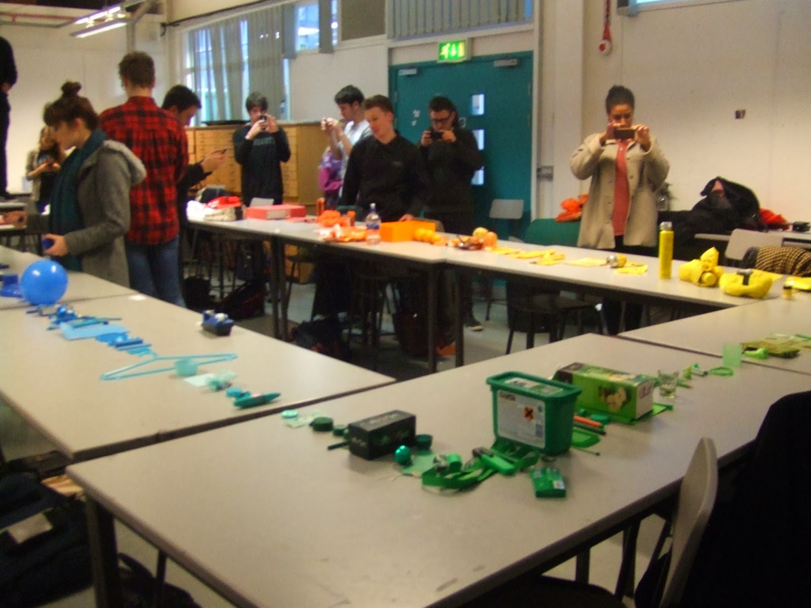
We were helped to understand this by ordering the items we brought in a gradiented line around the tables. We found problems in that the shade or tint of an object affected our perception of what hue a colour was and ultimately where it should go in the line.


There are two types of mixing colour, additive and subtractive. Additive is when different coloured lights are shined on top of each other to cause different coloured reflections off objects, and that's how RGB works. By shining red, green and blue light on top of each other in various combinations you can create any chromatic value, which is made up from a hue, luminance (shade or tint) and saturation. Subtractive is about mixing pigments together to make other colours, which is how CMYK works. As you mix the pigments together they begin to neutralise each other, which is shown by the colour wheel.
When you mix complimentary colours together (colours opposite each other in the colour wheel) you get neutral colours. When you mix red and green, yellow and purple, and blue and purple you will get the same colour, because essentially you're mixing red, yellow and blue because essentially you're mixing red, blue and yellow every time.
We were helped to understand this by ordering the items we brought in a gradiented line around the tables. We found problems in that the shade or tint of an object affected our perception of what hue a colour was and ultimately where it should go in the line.
We then looked at how we can only identify what colour something is by comparing it to another object, which is what the above exercise was about. That's what pantones are about, and it was explained to us how they benefit the design community and help the printing process. We then practiced using the pantone system.
Under the light the values were as listed:
Postage Stamps - 485M
Tie - 201M
Jumper - 200M
Dress 7428M
We then checked our colour matching by turning the lights off, as the additive light should affect the pantone swatch and the item in exactly the same way if they are the exact same colour.
With the lights off:
Postage Stamps - 485M
Tie - 200M
Jumper - 199M
Dress - 7428M
That's not bad at all for a first effort, and I would suggest that the reason their is a slight difference is because we probably didn't have the appropriate set of swatches with regards to the materials finish.
Subscribe to:
Posts (Atom)