Showing posts with label Alphabet Soup - Illustrator. Show all posts

Thursday, 7 November 2013

Alphabet Soup - Illustrator - Print Induction

Today was our print induction for the digital print resource which included printing the font we'd each produced for study task 2 (here)

My Final Font Based On Vernation

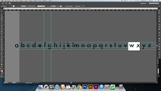
The font itself may not look too different to a classical gothic font such as Helvetica or Futura, but the x-height is 1.6 times the height of the ascenders and descenders to fit with the Fibonacci Sequence. I edited the v and w so that the points didn't rise above the x-height to fit to the patterns in nature, as well as moving the points on the z to line up with the straight terminals. I also raised the tittles of the i and j to be lined up with the ascender height. The letters with circular bowls such as a, b, d etc have an inner radius:outer radius ration of 1:1.6 to fit with the Fibonacci sequence, as well as the c, e and o being perfectly circular. The letters with shoulders however have inner:outer radius ratios that vary slightly around 1:1.6 to represent the anomolies in nature that don't fit the "rules" such as the platypus.

Monday, 4 November 2013

Alphabet Soup - Illustrator

I Started Re-shaping The Bowls On The Letters To Make The Bowls Perfectly
Circular, As This Would Allow Me To Use The Golden Ratio To Make The
Bowl:Counter Ratio Apply To The Fibonacci Sequence.

How I Layed Out My Font On An A2 Illustrator File


Friday, 1 November 2013

Alphabet Soup - Illustrator

Initially I Was Going To Develop The Letters By Changing Their Dimensions
So Their Height:Length Ratio Was The Golden Ratio Of 1.6:1, But Stretching The
Letters Messed With The Line Weights Of The Letters Too Much. So I Decided
To Take A Different Approach.


Lined Up The Alphabet So The The X-Height Was 8cm

Added Guides For Ascenders And Descenders 5cm Further
Up And Down As This Is A Multiple Of The 1:1.6 Golden Ratio

I Then Altered The Heights Of The Ascenders And Descenders
So They Lined Up With The Guides

I Chose To Use Lower Case Letters Because They Allowed
Me To Edit Descenders
I Then Noticed That The Points On The V And W Went Above
And Below The X-Height And Baseline, So I Edited This To
Make Them Fit In More With The Other Letters.


Another Thing I Noticed Was The The Dots On The I and J
Were Floating Around In A Place With Seemingly No Reasoning
To Their Positioning, So I Moved Them To Be In Line With
The Ascenders Of Other Letters