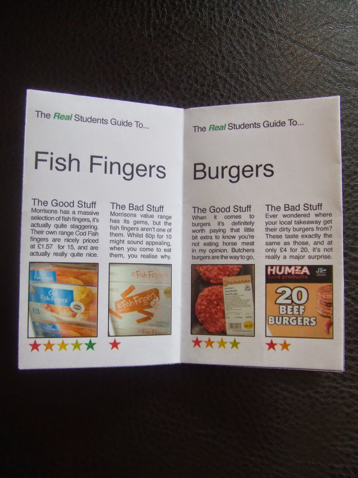
There are two reasons behind me only describing one food product on each page instead of two. The first was that if you’re advising someone on what they should buy, then essentially you’re suggesting that they don’t buy anything else, so there’s really no need to single out one particular product not to buy, and this will avoid me having to use things with negatie connotations in my design. The second was that the advice from the crit was that the booklet was far too text heavy, which I agree with in retrospect.
Size, Format and Layout
I was going to keep the fundamental content the same, and had no particular reason to change the format of the book, but because I was reducing the amount of text on the page, I increased the amount of space taken up by the title to reduce the amount of whitespace. I stuck to the two columns but never used them for full on blocks of text side by side, and so the layout does look a lot less intense than it did previously.
Colour
Now that all the content on the page is positive, I didn’t have to the problems of mixing connotations, and so I stuck to the Waitrose green as whilst green has positive connotations, it still has the ironic factor to it because of the huge difference between the food Waitrose sell and the food in the booklet.
Fonts and Text
The first thing I did was change the title font. I used a woodblock style slab serif font as I feel that it has quite jolly and happy connotations, and my research into student cookbooks and supermarkets suggest that wider fonts tent to be used in more carefree branding for simpler products and companies. I ended up using a font called Siserrif as it fits the above requirements, although it does look very similar to the typeface Morisons use in their logo. The feedback was that Helvetica was too generic to use in this sort of book, and that I should use something a bit different. I maintain that I needed to use a sans serif font for legibiilty on a small scale. I experimented with a couple of other fonts before deciding Gotham Book was appropriate as the very rounded shapes of the circles have a carefree attitude about them. I changed the leading to -30 though, as I felt the spacing between the letters was far too large.
Images
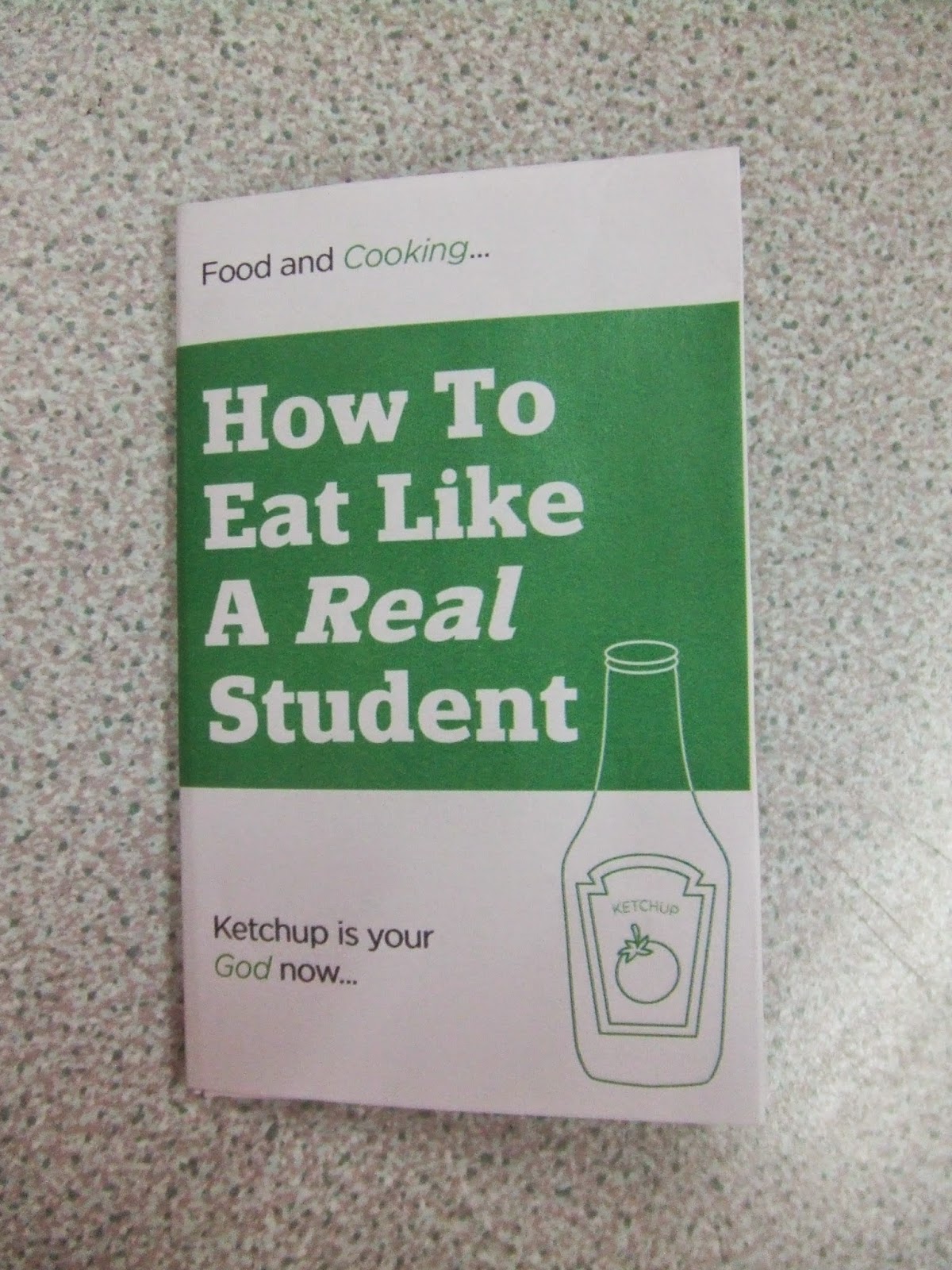
It was suggested in the interim crit that I replaced the photographs with drawings. I disagreed because I felt that photographs were more functional and useful. But the re-design of my booklet gave me space to include some vector images, and I'm glad I put these in, because I think they make the tone of the booklet a lot less serious, which is something that the original booklet was lacking, but using them with the photographs allowed me to maintain the usefulness of the photos.
I felt that the booklet was a little too flimsy, and so tried printing on thicker stock. I chose stock that was a creamy colour as well to experiment with how it would look on an off white background. The photo above shows a close up of the front cover of the booklet, and shows the cracks in the ink over the spine in the book, and this meant that using thicker stock was out of the question. I also felt that the off white had a horrible contrast with the green, and so decided to stick with the white background.
After doing a final check of my outcome, I noticed there was a problem on the chicken page, where I'd messed up the process of preparing the InDesign file for print. This caused me a few problems as I had to go through the process again, which wasted about an hour.


